Saturday, October 10, 2009

video reflections - seymour powell: designing dream machines


‘Designing Dream Machines’ featuring Dick Powell and Richard Seymour gives the audience an insight into the design processes and practices; from the pen to the final product. Powell Seymour focuses on creating a sound concept and nurturing the idea. A great example was the batman motorcycle, it displayed the strong development process needed to design that ‘x-factor’. The video also focuses on the industry concept of ‘client satisfaction,’ designers need to be aware of many factors including the client’s needs and requirements. Communication is an integral part in the design process; without meeting the client’s needs, design is not complete. This video emphasises the importance of identifying the problem and the stages of working through solutions until the manufacturing process.


Thursday, October 8, 2009

project three: upcycling unwanteds


Squirreel iPod Cozy - Long gone are the days of making mix tapes, but the classic cassette tape isn't completely useless. This design takes a 'back to the future' approach, mainly comprised of old cassette tape reel along with off cuts of felt and polypropylene. The product merges the past and present, through upcycling the internal magnetic reel and knitting it into a practical crafty cover for current media wares.

For the most part, the product is made from completely from waste material with the cotton thread being the only virgin material used. As the brown tape is quite ordinary and unattractive, I chose to create a squirrel motif to make a whimsy and more appealing design. The plastic latch at the top creates a closure for the cozy as well as adding to the overall design by balancing out the motif on the front.

As cassettes are rarely used these days, most tapes are thrown out in the rubbish (if they aren't still lurking in people's garages) and therefore being added to landfill. By breathing new life into this vintage object, it increases the value of the obsolete product.

The final product is not unlike my original concepts, I wanted to use the tapes for a practical purpose and found that utilising the reel would be a good idea to do so. Through trial and error, I came to the conclusion that knitting the reel seemed to be the best solution for creating a new material out of a virtually defunct item. Constructing an iPod cover stemmed from the idea to merge the past and the present, which seemed ironically fitting. Surprisingly, making the product used approximately 70% of a standard 60 minute tape, meaning it effectively made good use of the original product.


Peer comments:

Sunday, October 4, 2009

video reflections - annie leonard: the story of stuff

" ...you cannot run a linear system on a finite planet indefinitely" - Annie Leonard gives a frighteningly truthful and informative talk in her video: "The Story of Stuff". Extraction, Production, Distribution, Consumption, and Disposal; Leonard has broken down the cycle into five sections.

Extraction is the process of, what Leonard frankly puts it, "trashing the planet". We are using up all the natural resources by mining and cutting down trees, etc. As the planet has a limit, and we've already used up one third of the planet's resources, it's only a matter of time before we have nothing left.

Production uses energy to run factories that pump out toxins into the air, which is not only bad for the surrounding environment, but also for the population. Toxins in, toxins out means we're enclosing ourselves in a toxic habitat and leaves by-products and pollution.

Distribution is the act of selling the goods to keep inventory moving so as to make room for the production for more goods. The cost of products are externalised, we aren't paying for the goods we purchase. It ends up like a reverse domino effect, others are paying for our products; shop assistants pay by receiving poor wages, the people in the production phase are paying by risking their health, and the environment pays by having its resources exhausted.

People consume to upkeep the flow of production, 99% of the material goods we purchase are disposed of within 6 months. This is so because of two reasons: planned obsolescence and perceived obsolescence. Products are intentionally made to break down within a short period of time to accelerate the level of production; the more people buy the more goods can be produced. Perceived obsolescence is an interesting notion, it makes us think that the products we own are out of style and that we need to buy more goods. Advertising and the media target consumers to think they are less than they are, thus buying more material goods. Advertising brainwashes consumers into thinking they need to ‘keep up with the Jones’ in order to be happy. It seems like a vicious cycle; we work then come home and watch TV to then be bombarded with advertisements that tell us to shop, go out and buy things we most likely don’t need then go back to work to pay off the things we buy. The pattern repeats itself and therefore keeps the cycle of material goods alive.

It's shocking to find out how the products we purchased are disposed of landfill and incineration don't seem like healthy options for both the planet and its inhabitants. Industrial designers need to look into more sustainable options when designing goods. Recycling is an effective alternative to eliminate the extraction stage. By keeping the cycle of material goods in mind, industrial designers have the chance to make intentional responsible decisions when it comes to making products.

Image source

Sunday, September 27, 2009

project two: postal presents


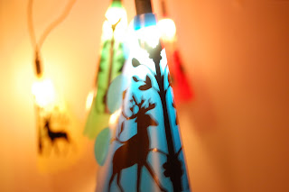
OH MY DEER! PARTY LIGHTS! FLAT PACKED! AMAZING!

The receiver opens the C4 envelope to find these colourful and delightfully whimsy light covers that are fun and simple to assemble. They have the ability to fit over any standard fairy lights and come in a variety of colours that can be changed to suit any theme, i.e. red and green for Christmas.

The idea behind these party light covers stemmed from Mexican celebration decorations known as 'papel picado'. These elaborate decorative pieces are hung up for fiestas, usually for Christmas, Easter, weddings, and christen
ings. I had the idea to take party decorations to a different level and incorporate both party lights and papel picado in one. The light covers serve the purpose of both a party decoration and gift. The decision to embellish the covers with a more traditional American folk art design was made to bridge the gap between Mexican and American folk art, making it open to a wider market.

They make a fun and interactive gift for people of all ages. Assembly is easy as the cover is folded around and slotted together using the tabs.


Made from 0.6mm polypropylene, with the design adhered with black contact, they are able to be kept for a long period of time. Polypropylene was chosen as the sheet material for its properties; it is fairly low cost, is tough and durable, has good resistance to fatigue, and won't melt under low energy light bulbs. As the design is fixed by adhesive contact, it can be changed to give it a fresh new look as the recipient desires.


Peer comments:


Sunday, September 20, 2009

video reflections - ross lovegrove: the power and beauty of organic design

"I am known as Captain Organic" - Ross Lovegrove would not be described as modest man; his talk on 'the power and beauty of organic design' highlights his self confidence in his designs. Lovegrove focuses on organic form and its ability to touch people's soul and emotion. Lovegrove breaks down his design philosophy into one term: DNA - design, nature, art. Lovegrove has reinvented his work in order to keep up with current processes, he condenses design into natural growth patterns and studies the fluidity of form.

The City Car was an interesting way of simplifying a vehicle from 30,000 components into 300. The engine-less car works on solar power, which makes sense that he would utilise a natural power source as all of his work is based on nature. Lovegrove makes use of the solar power by having the car radiate light at night and transforming the car into a street lamp - a simple, yet ingenious idea.

The DNA Staircase disassembles a regular staircase into an alluring exhibition of nature's raw beauty. By stripping it down to its bare minimum, the design displays the sound organic form of the cellulose structure of DNA - which appropriately links in with his design philosophy - coincidence? I think not. It's clear that Lovegrove considers every facet when designing.

As Lovegrove takes us on a tour of his studio and we enter his 'real world', something architects and designers rarely divulge, the audience gets an understanding of the inner workings of Lovegrove's mind; it's filled animal skeletons, chairs, bikes, sculptures (and a jelly mold). This insight is an interesting way of comprehending his thought process and the way in which is works. As Lovegrove states, "..industrial design is the art form of the 21st century"; industrial designers can greatly benefit from Lovegrove's philosophy, his work portrays a strong base of understanding organic forms and structures which are extremely important factors for designers.


Monday, September 14, 2009

task four: bad design


Hmm...what does this button do? It's on the side of a car door, just below the window and there's a 'Left' and a "Right" ....so it's for the windows? ...but windows obviously don't move side to side! This control is actually used for adjusting the side mirrors.

The design is 90% there, but fell short of clearly demonstrating what the buttons are used for. The labels of 'L' and 'R' are unmistakably for left and right; and the arrows pointing up, down, and side to side are obvious, but the lack of a graphic to show what the buttons are actually for, make the design poor in communicating its purpose.

The design is confusing because of the missing symbol, as the control is important the operator would only find it by either: a/ trial and error, or b/ reading the car's user manual. Curiosity would most likely be the way the operator figures out how to use it, and even then they may be cluelessly adjusting the mirrors. The addition of a simple graphic of a mirror would vastly improve this design eliminating any confusion the operator may have.

Wednesday, August 26, 2009

project one - peer comments:

Alfred Boyadgis


project one: experience enrichment


Sewing can be a fun and enjoyable activity, however the need to unpick stitches, is not. Although not always aesthetically palatable or pleasurable to use, a seam unpicker is an essential item in any sewing kit. The majority seam unpickers on the market are comprised of flimsy plastic without the ability to gain a sturdy, comfortable grip; not to mention hideously plain. Why not turn a grisly task into a peachy experience?

The base of my idea originates from the frustration of having to unpick stitches with the standard feeble tools available. This redesigned seam unpicker makes the job more bearable with its sturdy yet lightweight frame. Not only does this seam unpicker have an ergonomic shape for a comfortable grip for either left or right-handed users, but also it has the added feature of a needle threader at its base. This dual function tool eliminates the need to have both a seam ripper and needle threader in one sewing kit, freeing up space for other items. The design of the exterior is whimsical and cute with its playful yellow and black striped pattern resembling a honeybee.

Ideally, this product would be made of plastic for its lightweight properties. The product would not only be available in a range of patterns, i.e. ladybird print, butterfly pattern, etc. but it could be made in a broad range of plain colours to appeal to a wider market. For this particular design, the product is aimed at 35 - 50 year old housewives that enjoy making cute crafts and sewing projects.

Overall, this delightful product enhances the user's experience because it's simple to use, has a dual function, and is a fresh change of pace from the standard devices available.

Mood board:

Original concept:


Technical drawing:


Sunday, August 23, 2009

video reflections - yves béhar: creating objects that tell stories


"Together... maybe we can change the world" - Yves Béhar has been strongly influenced by story telling; he elucidates in creating objects that tell stories. After finishing design school, Béhar started working for a consultancy where he began questioning the true needs of people. He then branched out into designing on his own and focused on what was important to him - the human experience and matching human needs with functionality.

Y Water is a perfect example of taking an everyday object and launching it to another level. Taking a simple product such a water bottle and turning it into a healthy and organic drink for kids, epitomizes transformation in design. The bottles themselves are entirely symmetrical and have the ability to fit together and create a fun game for children to play with. Whilst looking at the shape, it unintentionally led to the development of its name - Y. 'Why' being one of the most important question children ask.

The XO '$100 Laptop' combines education and technology, the mission of 'one laptop per child' was the start of the of the XO story. The XO Laptop provides the world's poorest children with a low-cost, wifi connected computer, which is designed to promote education and learning through a fun and colourful medium. This product is inspiring, and knowing that children in less fortunate countries now have the opportunity to develop in ways they previously may not have had the chance to is heart-warming.

As Béhar exclaims, "Design is never done" - this statement perfectly encapsulates why designers need to constantly grow and adapt to current changes. As designers we have to think about how we can create a unique relationship between our work and the world.


Image source: http://www.designboom.com/eng/interview/behar/1.jpg

Sunday, August 16, 2009

video reflections - don norman: emotional design


This is neat! - Don Norman has cleverly narrowed down three ways good design makes you happy. Norman explores a triad of levels when it comes to connecting emotion and design.

The first category is Visceral; this level explores the way in which people like or dislike a certain item. Although this level is completely subconscious, we can intentionally control this in certain ways, i.e. choosing certain typefaces and colours to create a more pleasant compositions.

The Behavioural level is an automatic reaction and is all about feeling in control. When products have a certain heft and weight, we have a sense of being in control.

Reflective is the super ego, it's in the state of consciousness. It's the reason why people buy things simply because of the fact that they want it. It's the reason people buy cars we know don't work well; it's because they look impressive. It's the conscious decision of choosing a product for the sheer fact that it makes us happy.

These three levels of emotion are a skillful way of breaking down the design process. Awareness of these elements allows designers to identify ways to create good designs that make people happy:)

Monday, August 10, 2009

Sunday, August 2, 2009

video reflections - david kelley: human centred design


'Design is about humans now' - David Kelley is a forward thinking man, he has clearly illustrated this in his presentation on Human Centred Design. Uniting practicality and human needs into products provides the client with a fully customised design solution. Kelley's talk focuses on introducing behaviours and personality into products. By acknowledging the core of the client's needs, Kelley and his company IDEO have grown by leaps and bounds in the design industry. IDEO have formed a way of communicating the design process beyond the typical convention of 3D models and renderings with their concept of video production, giving it a more humanistic impression.

The work executed for Prada New York centres around customised technology. The shopping experience is enhanced through the use of interactive display screens to retrieve information on merchandise, lcd changing room doors with the ability to black out and clear with the click of a button, and a 'magic mirror'; a camera that enables the shopper to view their clothing from behind thanks to a 3 second delay. This incorporates interactivity in a practical way and emphasises designing for personable involvement.

Dilbert's Dream Cube really transforms an otherwise boring and dull office cubicle into an individualised space. The employee can work in a more home-like and relaxed atmosphere through the integration of natural elements such as a light that replicates the sun's movements throughout the day and a flower that slowly wilts as the day progresses. These subtle components alter the environment into a pleasant and more enjoyable work place.

Approtec is a prime example of designing to benefit humanity. The production of water pumps benefits communities by generating jobs for the population and providing year round commerce, which inevitably boosts the economy concurrently.

It is imperative for industrial designers to view such videos to get a sound understanding of the importance of fusing human needs and progressive problem solving. Remaining well educated in new discoveries is crucial in evolving a contemporary vision. Such developments not only inform, but inspire designers to think in a new light.


Saturday, August 1, 2009

task one: shape of a scent

Summertime, relaxation, floral, fruity; womanly. The scent transcended charming notes of citrus and blooming clusters of wildflowers. It was apparent the scent was a womanly fragrance, with this is mind I set out to create a 'shape', using plasticine, that exhibited its feminine inflections.

I placed emphasis on a curvaceous form, making the object smooth and shapely. My three attempts were, to say the least, very monotonous. I found it quite difficult to convey the essence of the enchanting fragrance in a simple shape (and it did not work in my favour that I had not read the brief thoroughly). My final effort, did not turn out as successful as I had hoped. Perhaps it is because I had invested too much attention on sculpting a curvilinear form, and less on creating a vessel.

Nevertheless, there are a myriad of elements I would alter if I were to redo my attempt.