Sunday, September 27, 2009

project two: postal presents


OH MY DEER! PARTY LIGHTS! FLAT PACKED! AMAZING!

The receiver opens the C4 envelope to find these colourful and delightfully whimsy light covers that are fun and simple to assemble. They have the ability to fit over any standard fairy lights and come in a variety of colours that can be changed to suit any theme, i.e. red and green for Christmas.

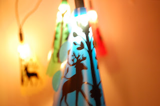
The idea behind these party light covers stemmed from Mexican celebration decorations known as 'papel picado'. These elaborate decorative pieces are hung up for fiestas, usually for Christmas, Easter, weddings, and christen
ings. I had the idea to take party decorations to a different level and incorporate both party lights and papel picado in one. The light covers serve the purpose of both a party decoration and gift. The decision to embellish the covers with a more traditional American folk art design was made to bridge the gap between Mexican and American folk art, making it open to a wider market.

They make a fun and interactive gift for people of all ages. Assembly is easy as the cover is folded around and slotted together using the tabs.


Made from 0.6mm polypropylene, with the design adhered with black contact, they are able to be kept for a long period of time. Polypropylene was chosen as the sheet material for its properties; it is fairly low cost, is tough and durable, has good resistance to fatigue, and won't melt under low energy light bulbs. As the design is fixed by adhesive contact, it can be changed to give it a fresh new look as the recipient desires.


Peer comments:


Sunday, September 20, 2009

video reflections - ross lovegrove: the power and beauty of organic design

"I am known as Captain Organic" - Ross Lovegrove would not be described as modest man; his talk on 'the power and beauty of organic design' highlights his self confidence in his designs. Lovegrove focuses on organic form and its ability to touch people's soul and emotion. Lovegrove breaks down his design philosophy into one term: DNA - design, nature, art. Lovegrove has reinvented his work in order to keep up with current processes, he condenses design into natural growth patterns and studies the fluidity of form.

The City Car was an interesting way of simplifying a vehicle from 30,000 components into 300. The engine-less car works on solar power, which makes sense that he would utilise a natural power source as all of his work is based on nature. Lovegrove makes use of the solar power by having the car radiate light at night and transforming the car into a street lamp - a simple, yet ingenious idea.

The DNA Staircase disassembles a regular staircase into an alluring exhibition of nature's raw beauty. By stripping it down to its bare minimum, the design displays the sound organic form of the cellulose structure of DNA - which appropriately links in with his design philosophy - coincidence? I think not. It's clear that Lovegrove considers every facet when designing.

As Lovegrove takes us on a tour of his studio and we enter his 'real world', something architects and designers rarely divulge, the audience gets an understanding of the inner workings of Lovegrove's mind; it's filled animal skeletons, chairs, bikes, sculptures (and a jelly mold). This insight is an interesting way of comprehending his thought process and the way in which is works. As Lovegrove states, "..industrial design is the art form of the 21st century"; industrial designers can greatly benefit from Lovegrove's philosophy, his work portrays a strong base of understanding organic forms and structures which are extremely important factors for designers.


Monday, September 14, 2009

task four: bad design


Hmm...what does this button do? It's on the side of a car door, just below the window and there's a 'Left' and a "Right" ....so it's for the windows? ...but windows obviously don't move side to side! This control is actually used for adjusting the side mirrors.

The design is 90% there, but fell short of clearly demonstrating what the buttons are used for. The labels of 'L' and 'R' are unmistakably for left and right; and the arrows pointing up, down, and side to side are obvious, but the lack of a graphic to show what the buttons are actually for, make the design poor in communicating its purpose.

The design is confusing because of the missing symbol, as the control is important the operator would only find it by either: a/ trial and error, or b/ reading the car's user manual. Curiosity would most likely be the way the operator figures out how to use it, and even then they may be cluelessly adjusting the mirrors. The addition of a simple graphic of a mirror would vastly improve this design eliminating any confusion the operator may have.